November 14th, 2014
Responsive Design

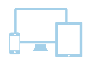
Smartphones and tablets have skyrocketed in popularity over the past few years. Not only are they becoming more affordable, reliable speeds of 3g/4g networks have made browsing the web from a mobile device more convenient. In some cases, households are using tablets as desktop replacements – no longer having the need for a full system.
We did some research through our Google Analytics account and the results are astonishing. Comparing data from five of our clients sites (ranging from e-commerce, to service oriented, to informational), we’ve noticed that only three years ago, mobile/tablet usage ranged anywhere from 5-12% of all web traffic. This past month, the same companies have seen mobile/tablet usage up to 30-40% of traffic.
What does all this mean for your website?
Basically, it’s time to start thinking of what your customer base is seeing when they visit your website from these mobile devices. Without a responsive design, your customers may have the need to constantly zoom in and resize their browser window to navigate your site.
By a “responsive design”, we’re referring to a web design that provides the best viewing experience across a wide range of devices (from small mobile phones to full desktop monitors) – with minimal need for the user to resize and pan aroud the page. This is different than creating a separate “mobile” website – which has a similar end goal (making the user-experience as clean as possible), but it also offers the flexibility of being able to update and manage one main site, rather than separate sites for separate devices.
I already have a separate mobile site – do I still need a responsive design?
Having a separate website dedicated for mobile users is perfectly fine (and for some industries – may even be better than a responsive site). Again, the ultimate goal is to create a web experience that is easy for your visitors to access and use. From an administrative perspective, a responsive website is typically less costly to manage – as you only need to update one website when changed are made.
Getting Started
NYLI can take a look at your current website, and make recommendations on the best way to proceed with creating a responsive design. Sometimes, it’s just a matter of modifying your website’s stylesheet’s to adjust the layout appropriately. If necessary, we can do a complete recode of your website, or even a full redesign. Contact us today and we’ll be happy to answer any questions you have!